5 Must-Have Retro Basketball Sneakers

fresh nike sneaker on happy face basketball

Whether you’re a basketball player or one of the fans, these basketball sneakers not only add umph to a get-up but also adds zest to your customized basketball jerseys, appearance and confidence.

Once called Non-skids, basketball sneakers were high-performance athletic shoes defined by their rubber soles and a canvas body. It was made to keep up with the ballers’ demand to keep their stance after running back and forth the basketball court and jumping to box out opponents in gaining possession of the ball by a rebound. The first one was invented around 1917. But the big breakthrough did not happen until the 1950s and 1960s. Different designs around the 90s had become ultimate favourites that up until now are hailed and purchased. And so this post is naming five retro Basketball shoes that are still a must-have up until now:

1. CONVERSE ALL-STARs a.k.a. CHUCK TAYLOR’S

Did you know that Converse All-Stars was originally manufactured and designed to play basketball with? Chuck Taylor joined a basketball team in 1917, and he was sponsored by Converse Company. The Converse Company then went on to become the first manufacturer of the non-skids when they customized one for Chuck, an American basketball player and later became an endorser and marketer of the Converse All-Stars. A little bit of trivia goes, he didn’t quite play for the NBA, but he did play as early as when he was 17 years old as a semi-professional. His career in basketball shortly lived because he was hired to promote the Converse Company. It was Chuck’s suggestion to change the upper body of the shoe into a soft that was intended to provide flexibility and to prevent blisters. Initially, only 2 colours were made, black and white, and so as of today, it’s still the classics that are widely purchased. Chuck was able to sell 600 million pairs as he went to conduct basketball sessions in sports clinics teaching basketball techniques and expertise. Sadly, he never got a commission, not for a single pair of sneakers. He was paid a salary, but that was about it. Converse All-Stars became the official basketball shoe for the 1936 – 1968 Olympic Games. Chuck Taylor retired from Converse in 1968 and in 2003, Nike absolved Converse at its own but continuously would sell Chuck Taylor’s in mass production. But with outbursts of the newest stylized Basketball sneakers, Chuck Taylor’s is now worn casually. But its’ branding of a star on the side says it all.

2. NIKE AIR JORDAN 1
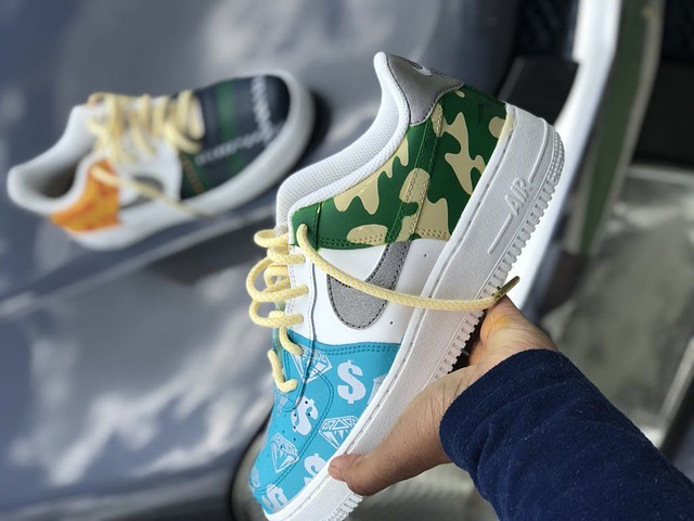
customised low top nike basketball shoes

As labelled, Air Jordan 1 is considered “the one that started it all”. This controversial shoes manufactured and customized personally for the legendary Michael Jordan (MJ) that introduced factors of being extremely lightweight, durability, comfort and style. MJ understood all of these factors that reflect a Basketball game for being fly and full of attitude. Moreover, these sneakers had made MJ win a lot of awards such as Rookie of the Year, but then it was known that its colours defied the rules about combining colours with their uniform. Its red and black combined hue made him pay US$5,000 fine at every game he wore this which in the end favoured NIKE by igniting the attention of people towards purchasing the shoes. And so on with the rest of the AIR JORDAN shoe series. Nowadays, fashioning Air Jordan 1 is hip and trendy all the more because of its retro feel and design.

3. THE REEBOK PUMP

The first Basketball Shoes who had an internal inflation mechanism which regulated the fit, making the wearer comfortably snug and supported uniquely from the upper tongue of the shoe all the way to the Achilles tendon. Because of this feature, the prize was different from the other athletic sneakers. Eventually, it became a status symbol amongst urban basketball courts.

4. NIKE AIR PIPPEN 1

The first-ever customized shoes for Scottie Pippen coming out into the limelight without Michael Jordan’s shadow. Manufactured in 1997, it is one of the hottest trending shoes that was designed with the Air Max bag. And this is what made it into the list. Air Max featured “airbags” or “air units” that composed the midsole of the shoes replacing the usual foam type to provide maximum support and cushioning to aid the knees as the impact of jumping gets to an extreme extent. Even though this attribute was challenged, again and again, sneakers collectors found the design of the air pockets being visible cool and edgy.

5. ADIDAS SUPERSTAR

This undeniable brand is earning loads because of its classic style and versatile function. The original Adidas Superstar, a.k.a the “shell toes” were the first basketball shoes with low tops and an all-leather upper. Though the show tops were popularized by hip-hop legends, Run-DMC, back when you had teams sporting short, short, basketball shorts in game, it became a constant hit ever since. This retro classic was manufactured way back 1969 for the Pro Model Basketball Shoe. The “clam toe”, “shell toe”, “shell shoes”, “seashells” or “shell tops” are now worn more casually than worn for sport. It is now known as Superstar II officially because it was redesigned. It is still sold in original Adidas stores up to the present with brand new colourways and designs. 


How to decorate inside your sailboat

Boat design ideas

If you are someone who loves the boating lifestyle, there are so many sailboat interior decorating ideas. It’s basically just coastal interior design – but with a more exclusive feel to it. Think Henri Lloyd or Fred Perry – but for interiors. You don’t have to stick to the old fashioned white and navy blue, nautical knotted rope design. Play with different accessories to create a unique style.

Using waterproof material

Everything from the flooring to the electronics to the upholstery will need to be marine-suitable. All the areas of a boat can end up getting sprayed with water. Saltwater is very corrosive and will cause damage to the equipment and materials. You need equipment and materials that can handle exposure to dampness, salt and water.

Avoid breakable, fragile items

There are essential factors to think about when planning the sailboat decorating scheme one crucial thing is the fact everything will be in motion all the time. You might love beach homewares such as shells, but when it comes to a storm, the motion can become very intense, and potentially end up breaking your precious interiors. You will need to remember this when you are shopping for things like tableware. The expensive china would not withstand the motion and wouldn’t be a good choice for tableware on a sailboat.  If you want photos, avoid the glass and go for plexiglass. Velcro hangers are suitable for hanging lightweight wall décor for this reason.

Sailing boat in the ocean

Where to find inspiration?

Not sure where to get some inspiration from? There are plenty of sources that have some helpful ideas for sailboat decorating, which include:

  • Marina stores
  • Boating trade shows
  • Online forums for designer boating lifestyles
  • Books on decorating sailboat interiors
  • Pinterest

Keep in mind just how much of a change that you want to make to the interior of the sailboat. You will also need to consider your budget. It can be expensive when it comes to decorating, so ensure you know your limits and what you can comfortably afford to spend.

The upholstery

New upholstery for all the bedding and seating cushions can make a big difference to the interior of the sailboat. You want to ensure that the material is mildew and mould resistant and suitable for marine use. Sunbrella has suitable marine fabrics in many custom textures and colours.

Flooring

Flooring is another change to consider. The marine vinyl flooring works well in a sailboat as it is weatherproof and very durable. The flooring can handle mildew, water and oils. There is also marine carpet on the market if you prefer to have carpet instead.

The windows

The new window coverings can make a vast improvement within the interior of the sailboat. There are different options to choose from, including drapes, motorised shades, blackout curtains and mini blinds. There are many choices when it comes to materials and colours to allow you to get the look and feel you want.

There are so many ways that you can customise the interior of your sailboat just remember to ensure everything is suitable for the marine world. Time to change up the interior and create something that you can relax in and enjoy. Add themed accessories around your interior. You can find some different ideas and inspirations from places like Pinterest and Instagram.

If you find you are having trouble coming up with some ideas, you can always get advice from a professional interior decorator, who can either do the decorating for you or can just offer some advice and guidelines that can help you achieve the look you want.

The Best Museums to Visit in Europe

gallery, architecture, museum

Every tourist’s itinerary includes visiting a museum display when Europe-bound. Besides the fact that Europe owns some of the oldest ones, the sturdiest forms of art and certainly the most historical ones reside in it.

From the early Roman civilization, many statues were made after people who stood up for something once upon a time. Sculptures told tales of people who have gone to battles and paintings were an expression of what was and what had become. The list could go on and on about the art that would connect the past from where we are now and a museum or exhibition showcase could enhance reliving all of these in one day.

Here are some of the best museums to visit in Europe:

1. THE LOUVRE MUSEUM

The Musée du Louvre, most commonly known as The Louvre, stands as the world’s largest art museum. Located in Paris, France, this is a house to 380,000 pieces from which 35,000 works of art are displayed. The Louvre is known for its varied collection, composed of sculptures, artifacts, antiquities, decorative arts, archaeological finds. It was divided among 8 curatorial departments namely: (1) Egyptian, (2) Near Eastern and (3) Roman Antiquities; (4) Etruscan, (5) Greek and (6) Islamic Art; (7) Sculpture (8) Decorative Arts.

museum, display, art

From the first time it opened, only royal and church confiscated property composed its exhibit with 537 paintings. As it stands for 226 years since it was established as a public museum in 1793, it is visited by an average of 15,000 guests per day in which 65% are tourists. This makes it the world’s most visited museum of art as it opened to 10.2 million visitors in 2018.

When visiting, witness its famous contemporary glass pyramid built by the first non- French architect, I.M. Pei, to have ever worked for the Louvre. As it stands erect as the biggest one of the four glass pyramids, the other smaller three surround the Cour Napoleon courtyard.

Also, don’t miss the experience of seeing the 21×30 inch – painting of Mona Lisa by Leonardo Da Vinci. Exactly 53×77 centimetres which make it slightly bigger than the A2 size paper. So, it is not that big as you expected though it is heavily guarded 24/7 and is enclosed in a bulletproof glass case. This French landmark opens daily from 9 am to 6 pm and until 9:45 pm on Wednesdays and Fridays. Free admission every first Saturday of the month from 6 pm to 9:45 pm (as of January 2019). This is a museum you should definitely consider seeking an international nanny recruitment agency or finding a temporary nanny for.

2. VAN GOGH MUSEUM

Van Gogh Museum ranks second-best in the world according to a recent study conducted by the Erasmus University of Rotterdam. Out of the 18 best museums that were tested for holding a good reputation, the Van Gogh Museum is the one that has a state-of-the-art, high-tech exhibition of a 3D meet and greets. Meet Vincent Van Gogh Experience as it is called, gives its visitors an impressive experience of a walk-through Vincent Van Gogh’s life.

Named after Vincent Van Gogh, Van Gogh Museum houses the largest collection of artworks of the Dutch who is famous for his paintings and drawings such as the ‘The Starry Night’. The museum stands dedicated to his work and his contemporaries ever since it opened on June 2, 1973. Over time, it garnered up until 2.3 million visitors that it became the most visited in Amsterdam.

It’s advisable to check their website constantly for their opening hours. For the rest of 2019, it is open daily except on Public Holidays which is on Christmas Day, New Year’s Eve and New Year’s Day. The busiest times are from 11 am to 3 pm. That being said, the best time to go is before 11 am and after 3 pm. No more tickets would be sold 30 minutes before closing time.

3. VATICAN MUSEUMS

Housing 70,000 artworks with 20,000 on display, the Vatican Museums, as a collective, rank as the 4 th most visited art museum in the world. With more than 6 million attendees, these museums, as a collective are also amongst the largest. Located within the Vatican City, Rome, Italy, the Vatican Museums were considered Christian art museums because of the massive collection of the popes throughout centuries. The most renowned Roman sculptures and the most important masterpieces of the Renaissance Art are held precious by the Vatican Museums.

museum, architecture, art

From being established in 1506, the place flourished with 54 galleries, a red papal throne made up of marble, roman sculptures, a tombstone, a double-helix double spiral staircase, called the Bramante Staircase, topographical maps and many more. Don’t miss out on seeing Michael Angelo’s masterpiece, which lines the ceiling of the Sistine Chapel; the Raphael Rooms with many of Raphael’s works including his workshop and masterpieces namely, “The School of Athens”, that lasted from 1509 to 1511.

The Vatican Museums are open from Monday to Saturday from 9 am to 6 pm in which final entry is set at 4 pm. A small adjustment every last Sunday of the month in which they are open from 9 am until 2 pm only. The final entry is set at 12:30 pm on that same day.

Travelling is full of things to explore and learn. Museums are a one-way ticket to acquiring information fast with tangible proof making each new thing easier to remember and understand. See and experience them for yourself. It will feed your curiosity substantially.

How to Prepare yourself for Halloween Season and Celebration

Glowing eyes from the pumpkin

Before preparing for Halloween, you’ll need to know some of its traditions. This festival has come a long way. Originally, the idea was to celebrate All Saints Day. It was mixed up with Samhain’s traditions and called the All Hallows Eve. Later, Halloween became an event for eating candy, unusual costumes, and trick-or-treating activities.

WHAT IS HALLOWEEN? –  DATE AND ORIGIN

Halloween is a yearly holiday celebrated on the 31st of October. As an ancient Celtic festival, Halloween originated from the traditions of Samhain. During the Samhain festival, people often light bonfires wear costumes to ward off ghosts. The origin of Halloween takes root in the ancient Celtic festival of Samhain. Halloween has been celebrated for more than 20 centuries in France, Ireland, and England.

PREPARATION FOR HALLOWEEN

One of the simplest Halloween costumes is with the pumpkins. Adults and children can adorn costumes that are made from pumpkins and other materials to Halloween parties. Also, pumpkin costumes have been a classic symbol of Halloween. But now the idea has become something else altogether. Kids, teens and adults dress up in various eccentric yet innovative ways which may either be as extreme as cute to freaky! Costume ideas include robes, colourful clothing, blood paint, whiteout contact lenses, bruise and scars make up, and plenty more.

Tips

Any adult can do a low-cost DIY pumpkin costume. Get an orange (colour) t-shirt or sweater, and black fabric. Other items for this no-sew pumpkin costume are a pair of scissors, VELCRO stick-on for fabrics, and a pen.

The first step is to get an image of the pumpkin costume. Then, draw the image on the black material. The images include the pumpkin face and other patterns. Cut them with a pair of scissors after sketching these shapes.

With the stick-on glue, attach each of these shapes on the t-shirt or sweater carefully. Adults can always consider the option of Halloween contact lenses of different colours to add more of a freaky and scary effect to their costume idea.

CULTURAL BELIEFS OF HALLOWEEN

According to the Celtic festival of Samhain, the period of dark, cold winter is the end of the summer harvest. They believe that it’s a time of the year for commemorating the death of everyone that once lived. Also, the Celts think that this event should be held on the eve (night) of a new year. For them, that day is the boundary of the old world (dead), and the new (living). However, a special date (night on October 31) was chosen to celebrate Halloween, and the stories of ghosts (dead people) returning to the earth.

Halloween pumpkins

It might be a weird story, but Halloween is accepted across Europe and America. Even in Australia, people celebrate these old Celts beliefs. Before civilization, Druids and Celtic priests could communicate with the spirits of dead people. With this access, they could make predictions of earthly events. The strange addition is dressing up; in the old days you wouldn’t have seen people walking around in cloaks and red colored contact lenses – but is now part of the custom.

COUNTRIES WHERE THE HALLOWEEN CELEBRATION IS POPULAR

Here’s a list of countries where we expect a big celebration during Halloween. Most times, there are large processions in the cities of these countries. Children often move about with candies and sweet things to eat. They go from door to door bearing gifts, wearing weird costumes, and masks.

  • Belgium
  • Canada
  • England
  • France
  • Germany
  • Ireland
  • Austria
  • Japan
  • Mexico
  • Latin America
  • Sweden
  • Spain

Halloween is a special festival that comes with a holiday. During Halloween, children knock the door and keep bowls at doorsteps. This practice is meant to keep ghosts away from places of residence. It’s like an appeal to dead people that requires special offerings.

You can talk about Halloween stories without superstition and magic. Since it’s an end-of-summer festival, tourists also love to enjoy Halloween parties. If you plan to attend your first Halloween party, get ready for some mysterious practice like keeping lit candles by roadsides. Some Halloween enthusiasts might invite you to offer drinks to friendly spirits.

However, Halloween partygoers have been involved in vandalism and civil unrest. Sometimes people move Halloween parties from private places to classrooms. The trick-or-treating game is one of Halloween’s high point that brings fun for adults and children.

Art From Ancient Times

Have you ever wondered why the ancient collections of an art museum inspire people? Generally, art is used to tell stories about civilization, places, cultures, conquest and so on. For example, most of the ancient Greek art symbolizes European civilization and historic accomplishments. However, Greek art isn’t the only important type. Ancient Roman, Egyptian, and Asian art (such as Indian and Chinese) has had a significant impact on history.

I started thinking about this when I was at a conference venue in Hobart – as they had heaps of ancient art on the walls. Maybe as we walk down this artsy memory lane, this article might inspire a new love of art in you as well?

Has Ancient Art Influenced Human Development?

It’s common for every culture to create and develop their art. As part of their culture or social lifestyle, people need to preserve their heritage. Since the Stone Age, human beings have used arts and crafts to display their history and orientation. In Africa, ancient art was used to appease the gods, display their heritage, and frighten external aggressors (enemies). Regardless of the origin, ancient art has influenced different civilizations, and it has been the take-off point for contemporary art. 

Since primitive cultures didn’t follow a specific design, the styles of ancient arts followed their respective periods of evolution. Each piece of ancient art (single or collection) was created in its unique style, and it was used by philosophers, kings, artists, thinkers, and commoners.

Greek Ancient Art is Significant in History

Before the Romans conquered the Greek, the latter had developed a rich ancient value from their arts. However, between the periods of 30,000 B.C.E. to 400 A.D, Greek arts (paintings and sculptures) were displayed in most public places of Athens. Some were nude displays of human bodies that expressed different moods, stories, and beliefs of that era. Also, most artworks of the ancient civilizations were displayed by Egyptians, Chinese, and Romans. 

Even dance steps and religious rituals were also expressed in various forms of art. According to myths and legends; the Parthenon was the temple of the Greek goddess – Athena. It’s believed that ancient Romans copied their artistic and architectural designs from this building and other Greek inspirations.

Why is Art History Important? 

Ancient art is not as colorful as contemporary designs. However, it was important for custodians of most cultures around the world to express their ideologies, and thoughts with art. In museums, arts don’t fail to evoke emotions in enthusiasts and students of history. Originally, the Greek ancient art became very popular around 450 B.C. 

After a female nude statue was sculpted by Praxiteles, many artists across Europe saw this masterpiece as a symbol of female beauty and fertility. Antique art has also contributed to the economies of most societies. Usually, ancient arts are smuggled and stolen because of their high economic values. These ancient pieces come as original antiquities that have seen many centuries and are regarded as uncommon crafts.

Art and crafts are decorative items that have been integrated into different lifestyles. Different artistic designs have been used to enhance the appeal of objects like weapons, furniture, bowls, buildings, pitchers, etc. It was the conquest of Greeks by the Roman Empire that promoted a lifestyle using arts to depict social status. During the 146BC, the statue of (Emperor) Augustus Caesar was all over Rome. A close look at this Prima Porta statue shows a similarity of facial features with ancient Greek arts.

So, one of the importance of Greek’s ancient art is the influence it has on Roman art. The symbolism, colors, and elements of ancient arts are being taught to students in universities. This aspect of humanity has brought educational development, knowledge, and inspiration to students that have chosen to be scholars in this field. Even Nazi Germany copied the same artistic materials that were used by the Greeks.

An extra tip! As I mentioned before, I was on a trip to Tasmania when I first started researching this topic. I will write more about the experiences there soon – like the amazing fine dining options in Hobart!

The Best Tasmanian Artists

best tassie artists

Tasmania has given much to the field of arts and entertainment. This includes The Tasmanian Symphony Orchestra, the Australian International Symphony Orchestra School and the Federation Concert Hall to name a few. From the Hobart Summer Festival, intended to celebrate food and wine, to the Australian Wooden Boat Festival, which celebrates wooden boats, the culture of Tasmania is wide and varied. This can also be seen in the breadth of Tasmanian artists as well. Here are some notable artists:

  • Evan Carydakis

Evan is a jazz artist who has been captivating listeners for over 25 years now. His affinity with jazz and, in particular, with the saxophone started with ‘Royal garden blues’ by Branford Marsalis. Born in Egypt and then moving to Australia, this artist has learned from some of the greats, such as John Barrett, and studied along the late Joe Viola, Jerry Bergonzi and Charlie Banacos.

He has made appearances recently at the Davenport Jazz Festival, Clarence Jazz Festival and the Museum of Old and New Art and Hobart.

  • Catherine Rogers

A Tasmanian visual artist and printmaker, who mainly works with black and white linocutting. Her solo exhibition work ‘fractured’ was about Iceland’s surface, and it focussed on its glaciers and volcanoes. For this, she won the 2015 Nolan Gallery’s Print Prize. Her art can be found in many luxury hotels around Hobart and greater Tasmania. 

  • Adrian Bradbury

A highly talented painter and artist, Adrian received his Diploma of Visual Arts in 2003 from RMIT and graduated with Honours in Painting at the University of Tasmania in 2018. He has twice been a finalist in the Waterhouse Natural Science art prize, in 2016 and 2018 respectively.

His work has been used in many formats, most notably being featured in Lume, White Horses, The Mercury, The Examiner, and The Advocate. His work can currently seen on display at a popular Hobart waterfront accommodation spot. 

  • Anne Kellas

The author of the White Room Poems (2015), Poems from Mt Moono (1989) and Isolated States (2001), Anne Kellas is a poet, editor and mentor. The ‘white room poems’ is about grief, a subject she studied as a part of her master’s degree after moving to Australia with her husband and two sons.

Influenced by Yeats and Wordsworth, she defines her art as abstract lyric, which is a perfect blend of wit and the serious.

Anne’s work has inspired many. In 2008, Matthew Dewey composed a song ‘Cycle of Poems by Anne Kellas’, which was based on the ‘Isolated States’. Scott McIntyre is currently working on a composition based on the ‘White Room Poems’.

She has given lectures in poetry at a tertiary level and she also often holds workshops and mentor sessions.

  • Harry Edwards

Harry is a jazz guitarist and composer and has acquired a wide array of knowledge of the art form through his experiences in Europe as well as the United States. These days, he mostly makes appearances in Hobart, performing at various festivals and venues, such as the Davenport Jazz Festival, the Clarence Jazz Festival, OzManouche and Hot August Jazz Festival.

He is an unaccompanied guitarist and has worked in duos and trios like ‘Isaac and Harry’, ‘Harry Edwards Trio’, ‘Django’s Tiger’ and ‘Ani and Harry’.

Harry Edwards trio is his self-titled debut album, released in 2015.

In addition to all this, he also runs an online gypsy jazz guitar school.

  • Olivia hickey

Olivia is a jewellery and design artist.

Her journey started with a visit to Africa, where she met a jewellery designer from South America. She largely focuses on designs that indicate the vulnerabilities of Tasmania. 

Her main focus is talismans and how they carve a culture by interacting with people’s mentality. Her work is mainly in silver, where she cast organic objects that are Gondwane in nature.

  • James Dryburgh

The writer moved to Tasmania when he was six.

He was a co-editor for the Times and he started writing in the year 2010. His first book came out in the year 2014 named ‘Essays From Near And Far’. He has also worked with his wife in El Salvador, raising funds for community projects. His articles have been published in Island magazine, smith journal and others.

Facts About Aboriginal Cave Art.

cave art

Aboriginal Cave Art

Aboriginal culture dates back up to between 60,000 to 80,000 decades. The first proof of Aboriginal ethos or philosophy is evident from the still visible rock art which dates back over 20,000 years. Ochres were used to paint rocks. There’s no written speech for Australian Aboriginal People, they use symbols/icons through their art to communicate their significant cultural stories through the generations. It’s crucial to pass information to preserve their own culture. The native artwork is centred on storytelling. It’s used as a chronical to communicate the understanding of the property, events and beliefs of the Aboriginal men and women.

The purpose of symbols is just another way of composing stories of cultural significance, teaching survival and use of the property. The interpretations of the iconography differ depending on the audience.

When being told to kids, it would take on a more straightforward form highlighting the behavioural and educational aspect. There can be a mix of information and ethical teachings behind the narrative. The stories nevertheless would be translated at a different and higher level form when instructing to pioneered elders.

Although Australian Aboriginals have been using ochres as body paint, on stones and bark for almost a millennium, it wasn’t until the 1930’s the first paintings were done. These were not done in ochre or scatter art but in watercolour in the Hermannsburg mission near Alice Springs.

Traditionally paintings by Aboriginals were drawn on rock walls, ceremonial articles, as body paint and most significantly drawn in dirt or sand together with tales or songs. The art we see now on canvas and board started merely 50 years back.

Lots of folks feel that dots were used to conceal information from white guys when the Aboriginal people became fearful that they would have the ability to see and comprehend their sacred, private understanding. The dots were used to obscure the key symbols or iconography underneath.

Aboriginal art differs in style and character depending on which area the artist is from and what language is spoken. Most modern art can be recognised from the neighbourhood where it was created.

The usage for ochre paints is indicated in Arnhem Land and east Kimberley. Materials (colours) utilised for Aboriginal art was initially obtained in the local land. Ochre or iron clay pigments were used to create colours like yellow, white, red and black from charcoal. Soon other colours were added like smokey greys, sage greens and saltbush mauves. During the mid-1980’s with more Aboriginal women artists, appeared on the scene and a broader range of contemporary colours were selected, and bright desert paintings began to arrive in the marketplace. Choice of colour is still an indicator of style in several communities; Papunya Tula, part of the western desert art movement is famous for its use of soft ground colours while many other Western Desert Communities opt for strong primary colours. The styles vary dramatically even in areas, and there’s no hard rule here as can be seen in many of Papunya’s artworks that don’t necessarily comply with this thinking.

Aboriginal art has caused a revival of the culture in various ways.

Ancient Cave Painting

Beginners guide to making your own Computer Game

computer games

Beginners guide on making your own Computer Game

Gaming is developed so fast so big over the past 10 years, and now new and improved games come year after year. You have got big studios filled with countless people. You have got little teams making amazing games. This is a wonderful thing because everybody brings their distinctive experience and sensibilities to match the design.

Have you got an idea for a game in your head that you wish you could play and isn’t still out in the market? I have got great news for you: you will find more resources and support than ever to assist those who do not have any experience with development or coding begin to understand how to make the games of the dreams. If nobody is making what you want to perform, why don’t you learn how to create it yourself?

Start Small and get ready to fail.

Your first game will not seem like the polished games you are used to playing, similar to your first drawing will not come out looking like Monet. This is totally fine. My first game has a massive bug in it that causes it to split for approximately half of its customers.

You Should shoot for what programmers call a prototype: a smaller version of your thought with a couple working mechanisms, a prototype that allows you to determine how your game plays, permits you to enhance the plan and forms the foundation which you can later build on in order to make a complete game.

As you Create your first game, you’ll also experience the exact same thing every other programmer has: “feature creep” or problems with extent. You will probably need to place too much into your very first game — too many mechanisms, too much content. Your ambition will push you toward numerous traps. This is OK, provided that you fix it or “extend down”.

For Your first game, distil what you want to see into one mechanic and try to make that one thing. Go with an easy mechanic like “browse a story by choosing your activities from a menu ” or “keep a thing from falling”. It probably will not be the next big thing, but it’ll be a prototype, and it is going to be something that you can build on in the future if you would like.

Choose your tools

So, you Have your thought, distilled down into a manageable, easy game. Now what? There are an enormous range of these, and more are being made all of the time. This guide is mainly for people who have zero computer science skills have never imagined anything in their life and believe that it is beyond their capacity to do so.

The Following tools can allow you to go from no development or coding expertise to getting completed your initial prototype.

I’ve Chosen to concentrate on these three tools since they have got the least-steep learning curve so that they could make a vast array of games, and they’re able to generate a prototype fairly fast (so that you can get the satisfaction of getting something playable sooner). They are all either free or have free versions, which means that you won’t need to drop a few hundred bucks to determine if this is something you need to pursue.

  1. Twine

If you have zero experience with coding or any type of programming, Twine might be an exceptional place to start.

  1. Stencyl

Another Recently established tool, Stencyl has a rather user-friendly graphical interface that can allow you to make a huge array of games. If you’re beginning to get the hang of coding, you can change to a mode which will allow you to view and edit the code in these”blocks”, letting you tweak or even produce code from scratch that will work with everything else in the app.

  1. Gamemaker

Very like Stencyl, but has some important differences. GameMaker employs a similar drag-and-drop interface strategy to code but uses its own language that only operates in GameMaker.

Get Some Graphics and Sounds

If You’re concerned about inventing art resources, music, audio and other things which make your game more polished, do not worry. Freesound.org has plenty of open-minded sounds, OpenGameArt.org can cover your artwork, and you’ll be able to search music websites like SoundCloud for open-ended audio.

If you Use anything that was produced by somebody else, make sure you’re using something under Creative Commons and do charge them into your game.

Find an Honest individual to play your game

So, you’ve prototyped your very first game — now what? Share it! See what they instinctively do, what they know and what they do not. Get as many people to play your game as much as possible and try to discover what worked and what did not. Then, iterate in your design as far as possible.

Do all of this again.

Finish your game, then make another.

Do some research

Studying Game design is something I would suggest for anyone who enjoys games, not just people who wish to create them? It’s a complicated skill which has many aspects and thankfully there’s a good deal of stuff you can check out on the situation.

Plenty Of individual developers provide talks on aspects of game design in their websites.

Ancient Techniques of Making Wire into Art

pexels photo 197868(1)

Wirework has been around since 3,000 BC. It is an ancient folk art form first practiced by the Egyptians.  By the mid 19th century, wire art flourished. The collections expanded from kitchen wares to wire fencing. By the 1920’s, wire sculpture had made its way to the world of fine art.

Basic Materials

You can measure the wire diameter in inches or millimeters as well as in gauges. Gauges range from 0 to around 50; the smaller the number, the thicker the wire. For example, a 16-gauge wire is thinner than a coat hanger, while a 30-gauge wire is almost like a thread.

Basic Types of Wire

  • Annealed wire is the most common wire used for basic crafts. It is pliable, durable and an easy-to-use wire. An example is dark annealed wire.
  • Armature mesh: a fun, versatile, flexible aluminum wire. This is ideal for sculpture, model making, arts, and crafts. If you want to do a mini sculpture of a cat or if you are more interested in machinery such as replicating a mini franna than you can also do so with this type of wire.
  • Bead stringing wire: made from many strands of fine diameter stainless steel wire. The smooth, kink resistant nylon coating that it has provides excellent abrasion resistance. One example is Tiger Tail. Tiger Tail actually had an industrial origin. It is one of the first wires used for bead stringing. Containing only 3 strands of stainless steel wire, it tends to kink if you’re not careful.   Most general beading designs use modern bead stringing wires. They are softer, stronger and more flexible than tiger tail. Bead stringing wires work well for stringing ceramic, glass, metal, stone beads, seed beads, and freshwater pearls. As the number of strands increases, the softer and more flexible the wire is.
  • Beading cord: comes in silk or nylon cord. A nylon cord is less expensive but is stronger than silk. It stretches less and feels like silk. Silk adds elegance and a natural drape to your designs. Beaders have been using it for centuries.
  • Coloured copper wire: consists of a copper core covered with colored polyurethane. It has a clear nylon overcoat that resists peeling or chipping. It can also stand extensive wire working, twisting or bending. A colored copper wire is perfect for wire wrapping, wire forming, and bead stringing.
  • Enamel-covered wire: bendable, yet holds its shape. It’s great for jewelry making, floral design and more!
  • Memory wire: from the name itself, it “remembers” its shape and retains its coil form. This stainless steel wire is available in anklet, bracelet, necklace and ring sizes. This rigid and tempered stainless steel wire is corrosion and tarnish-resistant.

Basic Equipment

You only need the basic kinds of pliers and wire cutters to start crafting; you don’t need any sort of heavy machinery or the largest cranes to get you started either.

  • Round-nose pliers are ideal for bending wires into smaller round loops or circles.  Its jaw consists of two smooth, slender cones. You determine the diameter of your circle. Wrapping the wire ¾ nearer the base gives you a larger circle. Wrapping it towards the tip gives you a tiny circle.   Squeeze the jaws together to see how the gap between the two cones tapers, closing at the tip. Find the spot in the gap that matches the wire thickness to choose the appropriate spot for wrapping. Half-round pliers are useful for bending wires into broad curves.
  • Flat-nose pliers have a flat smooth surface on the inside of the jaw. This makes it ideal for gripping without marring the wires. These pliers are also good for bending right angles into the wire.
  • Chain-nose pliers are similar to flat-nose pliers. The only exception is the flat part of the jaw which is finely serrated for a surer grip.    Serrated jaws will mar the wire, so be sure to grip the wire only in areas which you plan to hide eventually. Use the serrations to cut some tooth in a wire for a better hold at crossover points and wire wraps.
  • Bent-nose pliers slanted, serrated jaws help you work in complicated, hard-to-reach spaces.
  • Long-nose pliers serrated jaws have an extra strong grip and provide easy pickup.
  • Twisting pliers and wire cutters make tight, consistent spirals with minimal effort. The simple one-pull action and automatic return twist wire quickly and easily. You will then have strands that will not unravel. The center of the pliers also serves as a cutter.
  • Diagonal pliers will easily cut through wire up to 1.6mm.
  • Nylon jaw pliers (regular and thin-nosed) are coated with a thin nylon layer. They can gently flatten and harden wire without nicking or changing the diameter of the wire. These pliers are also good for removing bends and kinks.
  • Parallel or channel-type pliers are useful because of the jaws open and close parallel to each other.  Although the jaws are smooth, they grip well. They hold along their length rather than at just one point. These pliers are good for straightening bent wire or for bending angles.
  • Needle-nose pliers are useful for reaching into difficult places. They are the best kind of pliers for working with chicken wire. You can use the nose to open up loops, the jaw for crimping, and the outer surface as a form to shape curves and loops.

One Basic Technique

Wires are malleable.  You can braid, coil, twist, wrap, cord, wove, or crochet it into wonderful shapes. The possibilities that you can do with it are innumerable from creating little figurines or sculptures to forming product displays for stores.

Twisting Wire

If you wish to achieve texture, twist two or more wires together. The easiest wires to twist are the soft wires like copper. On the other hand, you need extra caution and effort when working with galvanized wires, especially when it comes to larger objects such as galvanised steel mesh panels. Letting go of the wires may cause them to spin dangerously out of control.

The easiest method for twisting wire is with a hand drill, giving you more control over the wire. Start with a piece of wire at least three times as long as the desired twisted length. Keep in mind that the tighter the twist, the more wire you’ll need. You then fold the wire in half and securely wrap it around a table leg or doorknob. If necessary, place some padding between the wire and the doorknob to protect the surface. You can also use a table leg in place of the doorknob. Place a cup hook in the drill, and secure both wires ends to the cup hook. While holding the wire taut, slowly turn the drill handle, twisting the wire.

You can have a modified hand drill.  Use a wooden coat hanger that has a revolving wire hook. Cut a piece of wire at least three times long as your desired twisted length. Fold the length of wire in half and loop it around a door handle or other secure point such as a table leg. Wrap both wire ends at least three times around the hanger, on either side of the handle, to secure. Step back until the wire is taut and begin rotating the coat hanger. For an even twist, hold the wire horizontally. Don’t relax your grip. Carefully, twist the wire to the desired degree. Make sure you do not over twist the wire or it may snap. You may then remove the wire from the drill or door handle and cut both ends.

Why use Art In the Home

pexels photo 706144

Wall art is often treated as an afterthought in interior design style. It’s what is usually dealt with last after the wall paint has dried and every piece of furniture has been put into place.

However, if wall art is not given importance, you could miss out a great design opportunity. Adding artwork is a great way to make your walls look elegant, create conversation pieces and create a flow to the decor of your home.

Even if you don’t consider yourself artistic, it’s still easy to decorate your home with art and paintings. These following tips can be your guide on how you can choose your pieces, you can hang art and paintings around you house without it being distracting.

It Provides an Instant Color Palette

Choosing the perfect color palette can be overwhelming. The choices seem endless and it can be difficult to decide the perfect color that can accent you home.

Our advice is to focus on searching for wall art instead of worrying about the paint chips. Once you found an art piece that you love, you can use that as inspiration for the color palette instead.

The first thing you need to do is pick out two to three shades from the art work that you can incorporate in your décor. Choose the dominant color as well as a few additional shades then look for these colors to correlate color patterns or other styles with existing elements in the room. For more ideas, use apps that will let you match colors to shades of paint such as Colorsnap.

It Creates a Focal Point

Having a focal point is one of the basic principles of interior design. It means having a single design element that draws the eye into the space, which makes a great wall art perfect for this position.

Picture your favorite artwork displayed in your living room or proudly hanging above the bed of your suite. Then again, choosing smaller pieces for narrow walls and larger pieces for big walls also creates a great impression.

It is best to consider the size of the wall art if you are planning to make it the focal point of your space.  An important factor when decorating with artwork or paintings is the scale of the piece in relation to the room. Wherever you decide to place the art, it needs to fit into the relative scale of the rest of the room or area so it doesn’t distract or get hidden by other items. Take for instance, when hanging artwork over a fireplace or other piece of furniture, it is good to remember that to find a painting or piece of art that is roughly the same size as the piece adjacent to it, creating a sense of balance and harmony. It is advisable to measure the available wall space, so you know how much space you have at your disposal.

It Brings a Sense of Texture

When it comes to art work, you need to understand that diversity is key to effectively decorating your house, transforming it to something completely spectacular. Remember that each all wall art is unique.

So, when choosing for wall art, look for diverse wall art product and medium, don’t just browse for two-dimensional paintings to help bring a varying sense of texture into the space. Coastal home interiors may need a more textured approach such as wood or rope pieces of art.

Moreover, you should also look for other decorative items that can help enhance the overall look of the painting. Considering pieces such as sculptures or shadow boxes which add a sense of depth to the room opening up the environment. Or you can go for some shadow boxes or a little metallic or wooden sculpture. The more textures there are the sleeker and elegant your room will end up looking. It doesn’t have to be a one picture/sculpture piece, you could also do a small mixed media installation involving screens and digital art.

Extra texture is an enhancement to your interior design, which also determines the tone of the room.  Rough textures can make the room more cozy and intimate while smooth texture brings about a more streamlined aloof tone.

It Makes the Room Appear Finished

Think about some interiors that are not quiet put together like in a college apartment or your first space after moving in on your own. Most of these spaces are bare and unfinished. More often than not, the walls are painted white and even with beach homeware the area still feels unconnected.

Wall art is that finishing touch that can help pull a space together and make it feel homey. You have to consider that your walls have the potential to either make or break your interior design. Just a little extra touch can make your space from simply looking functional to appearing as like a true home.

Lining your walls with some artwork that specifically match the surrounding colors of the room can add to the tone and mood of the room. It is not necessary to have a lot of decorative items; a large painting on the wall can definitely add the finishing touches in your house. The key is to choose an art piece or that fits in with the decorating style that you’ve already set for the room. After that, it’s all about choosing decor that you love and adding personal touches.

Choosing the best Wall art doesn’t have to difficult. Having wall art has become an almost crucial aspect of interior design, especially when it comes to identifying what type of color palette the room needs, the overall décor and the types of items you require to really set the mood in the room right.  When used properly, your wall art can provide an excellent outline around which you should be able to plan the rest of your space. We hope the post will help you on how to properly select and incorporate wall art into your interiors. Even if you are in Queensland and working with interior designers in Perth, they can cater to your style needs via skype or other online methods.

The Impact of Technology on Art

pexels photo 354939

Just as art in any form from any given society’s culture, the culture of the society is the mirror and outcome of the art.

The Use of the Art in Promoting Society

As the arts are a reflection of almost any society’s culture, the culture of the society – conversely – is your mirror and result of the arts. The synonymous relationship between the arts, as a cultural significance given to people,  along with the overall population which interacts with and embodies these values need to perpetually grow upward rather than deviating, even slightly, downwards. Not just with regard to heightening the respect and preference to aesthetic beauty, but also on other degrees like revering the value of morality, merit, science, and all of the additional values representing the backbone of their achievement and growth of any modern civilized society. Accordingly, the function of artists in most categories: literary arts, singing and music, drama, photography (wedding photos) and poetry has to grow to become an influentially favourable element that supports and pushes this synonymous relationship upward rather than, especially since the vast majority of artists compose the cream of society and therefore are respected and admired by the general public. In fact, an average people’s infatuation with performers generally places a higher responsibility on their shoulders to function as role models directing societies towards ethnic edification and improvement.

The Effects of the Evolution of Digital Technology on the Arts

Contemporary art was significantly affected by the rapid advancement in electronic technology and from the astonishing progress in the debut of new, more appealing and tougher stuff that artists may utilize. These two inventions have expanded horizons of imagination and opened fresh artistic frontiers. They also have enabled contemporary artists to decrease time spent on the actual implementation of art to a minimum thereby freeing them to concentrate more on contemplation, imagination and creating revolutionary ideas, in addition to sound preparation for art.  If an artist is operating as part of a company they may make the use of a mobile quality management system to make sure what is being produced is of the highest quality.

The Negative Hazards of the Effect of Technology on Actors

The extensive selection of alternatives available to artists via new technologies might occasionally have a dangerously negative impact just because they offer you the artists way of saying they imagined were possible. Faced with myriad alternatives, the artist might be overwhelmed, confused and puzzled and those feelings are promptly reflected in their functions. Their art might become more and more insistent and devoid of creativity or soul. Thus, the fire of imagination dies out along with the wave of inspirational revelation recedes along with also the building blocks of creativity freezing in the base of the artist’s mind, as they slowly dwindle their worker productivity, transforming into a shallow subjective interpretation of a constellation of technological capacities, devoid of any creative material.

The Human Touch

Digital technology and contemporary methods have had the most powerful effect on the craft of drawing and painting. Before, drawing and painting depended upon the artist’s abilities in wielding their conventional tools – the brush, the pen, charcoal or pastels. The artist, through traditional and calculated measures, were in charge of the density of colour, the levels of the various colours, the precision or abstraction of the work of art. Artists nowadays, on the other hand, work with clicks of their mouse, video programs and electronic colours, which if they apparently mimic old conventional tools connected to functionality, are still radically different concerning the use and design techniques and into the capacity to accomplish the desired artistic effect out of these. There’s not any doubt that the individual touch at the classical school of painting had a significant influence on the form of the painting and also the impact of these tools, especially once an artist used their palms to put the particular effects and rolls her or his work. Today’s modern technologies has, however, reduced the demand for the individual artistic touch in favour of a huge selection of varied and various instruments, each of which can be a mechanism which provides access to a much larger pair of tweaking and tuning options which open up infinite horizons for artists to express themselves creatively and correctly, to the level. A cloud management system allows artists to make sure their work gets paid accordingly without them having to worry about a physical copy but rather this paperless system. This stet of unlimited alternatives available to this artist has attained such a level that computer-oriented artists occasionally inadvertently create magnificent masterpieces by mere chance. Consequently, art upon conclusion may emerge radically different from the artist’s original conception of the painting.

The New Challenge

Possessing this huge amount of skills and tools have to be accompanied by an exhaustive and in-depth understanding of every detail of those tools and their abilities, in order to permit the artist to successfully interpret all their dreams and imagination through the designated instrument, together with the quickest and shortest way possible, a business coach may be a unique perspective and objective view of what the artist may be thinking.

To put it differently, artists these days are presented using a gateway to an imagination that’s complex and complicated, complete with a huge number of processes, and so artists will need to hone their abilities and comprehend these techniques well to be able to maximize the capabilities they provide. Regardless of the struggle, the artist has to once more become master of those enormous instruments and techniques to ensure that they eventually become the implementation tools by which they engage their vision and imagination and so the final outcome actually reflects their character.

In summary, there’s absolutely no question that modern artists are confronting increasingly more complicated and complex challenges to presenting identifying art on the surface of recent technological improvements that have expanded and diversified the art world. Certainly, artists now find it even more difficult than ever to exhibit original and innovative ideas, with top wedding photographers in Melbourne competing against each other for originality in capturing someone’s special day. They will need to employ themselves and extend their creativity to be successful. In addition, the gain in the condition of tension that normally surrounds us is now today the most powerful force, has one of the most powerful impacts and also is the main motivator for artists to drive themselves motivating them to keep their creative jobs without quitting.

Steps For Creating Your Next Exhibition

pexels photo copy

Ask anyone what they enjoy the best about going to an art show and many will tell you it is the opening night celebration they look forward too. And who can blame them, after all what better way is there to spend a day, than enjoying some brand new art whilst partying?

Here it is, a step by step guide to planning and staging an art exhibition.

Planning

You might be surprised at the amount of planning an exhibition requires. Factors such as places, budgets, funding, sponsorship, advertising and marketing, catering, and maybe insurance, all require careful consideration. Lead times can vary considerably as a result, with a few displays taking a year or more to install, while others can be ordered in a few months.

Budgets, sponsorship, and funding

Staging an art exhibition could be expensive, and you will need to ensure you’ve got enough funding, whether personal, or via sponsorships, to pay the price of items like catering, advertising, printing, and gallery space. You will need a budget for constructing staging and lighting. While recognised artists may be able to find sponsors to cover costs, as their bigger following ensures a fair amount of vulnerability due to their backers, new or emerging artists might not be so lucky, and will need to rely on savings, or help from family or friends. Check around though, it may be possible to obtain financing through arts grants, and sometimes municipal councils or community groups may provide some help staging a show, whether it be providing a place, or publicity.

Pricing your artworks

This is among the harder steps in the process of organizing an art show. The amount you can request on art will depend on a number of factors such as your reputation or standing as an artist. Clearly the more regarded your job, the more you may ask. Another is that the arrangement you have with the gallery displaying your work. Most galleries take a commission on works sold during an exhibition. Although this cut varies, sometimes considerably, rates of approximately 25 to 30 percent are fairly common.

Printing

When you have funding, a place, and a motif worked out, you can begin arranging the printing of promotional brochures and flyers, name cards, and a list or catalog of the things you’ll be exhibiting. If cash is tight though you might have the ability to decrease some printing costs by doing some of the work yourself. Great looking catalogues and title cards could be produced using a Word-processor, using good fonts, some cautious page design, and use an excellent printer.

Promote and market

There are quite a few choices when it comes to promoting displays, many of which are cheap, or free. Social networking sites, like Facebook, make it easy for members to create pages for occasions, like an exhibition opening, and issue invitations for their contacts. There is also artwork focused discussion forums, and you could also consider coming arts bloggers to find out if they will assist the spread the word. Be careful not to wear your welcome out, or take anything for granted here however.

Food, drinks, and catering

A big part of the opening night of any exhibition is that the food, drink, and party atmosphere, but you do not have to go overboard here however. Offering your guests a choice between a white and red wine, and water (and juice or soft drinks, in case you really need to push out the boat) is quite okay.

If have a generous host, or even find a place that does catering for functions, you might then also have the ability to put on beer and some finger food. If you are hosting your event around the Melbourne city, there are many options for you to choose places, which do fantastic catering, such as catering in South Yarra for events around the Melbourne area.

Opening times

Many of the shows I go to usually open on Wednesdays, Thursdays, or Fridays. Thursday seems to be the most frequent day, it is not too early in the week, and not too near the weekend. Prevent openings over weekends, or earlier in the week, times that people normally have other plans. An early day opening of about 6pm is likely a good all round time. Most your guests will be on the way home form work by then, yet it’s still early enough for them to fit your display in around other programs they have for later in the day.

Photos

You will definitely need a photographic record of this opening, so try and arrange for someone to take photographs through out the day. Post the pictures to your Flickr or Facebook pages, and use them when you write about concerning the opening on your site later.

Minimalist User Interface Provides Maximum UX

Web Design

It can be said that user interface when designed and executed correctly is an art form. Design is just one of the most significant drivers of consumer participation. As consumers’ preferences change toward a more straightforward interface, dividing the user interface to its very basic, essential components is the secret to success. It’s best strength is clarity of shape, blank lines, ample whitespace, and nominal graphic components bring simplicity to even the most puzzling subject matter. That is if it is used effectively.  

Minimalist design needs to be succinct, transparent, and constant to become usable. Your web platform should aim to handle issues to your users through apparent visual communication. This is the reason why an impressive minimalist program together with excellent usability is indeed remarkable: an easily comprehensible custom craft web design can be an extremely effective form of communication. However, to achieve this you have to concentrate on following points: 

Straightforward Color Scheme

Simplifying the colour scheme enhances the consumer experience as having a lot of colours may have a negative effect on it. There are a number of predefined colour scheme criteria which make creating new schemes simpler, particularly for novices. 

Monochromatic colour schemes are composed of unique tones, shades and tints inside a particular colour. By changing the saturation and brightness of one colour, you can create numerous colours where colour scheme isn’t overpowering on the eye. Analogous approaches are made by using three colours which are adjacent to each other on the colour wheel. There are a number of minimalist gesture-driven job manager programs which use similar colours to visually prioritize important jobs and highlight the most crucial ones (the top priority items will be the boldest in colour, whereas those lower on the list will probably be milder and more subtle). 

Blur effects

Blur effects arise as a plausible alternative to a minimal user interface, enabling a certain quantity of play with the hierarchy and layers of this interface. It is a really efficient option if working with layered user interface as it provides the consumer with a very clear comprehension of the mobile’s flow. Additionally, this gives designers a ideal chance to explore different menu and also overlay options. 

Importance of typeface

Mixing many distinct fonts can make your page look fragmented and cluttered. Changing the amount of fonts on a display can show the power of typography. When designing a program consider how you create the typography to be successful by playing with weight, design and dimensions, not distinct typefaces. 

Data Spotlight

Here your aim is to use large font size and striking colour to draw particular attention to the information in the middle. Employing neutral colours for the overall scheme and incorporating contrasting colours for calls to actions, enables the user concentrate on the actions that need to be taken. Improved font size and an accent color brings the consumers’ attention to a given area of the display without any further visual hints. This gives a simpler information-gathering experience to the web design. 

Diving by elements

Lines and dividers are frequently utilized to clearly define certain segments within a display. However, adding too many these components could lead to overcrodwed interfaces. Less dividers and lines will offer your interface a cleaner, contemporary and much more practical feel. There are different approaches to separate content using methods such as blocks, spacing or colours.  

As can be seen minimalist interfaces along with layout techniques are a means to reach good design, but they are not the main objective. The ultimate objective is to simplify the user interface creating a more usable and operational experience.  

The Art of Interior Designing

Interior Design

Interior design is relatively new and it is an artwork form that evolves constantly. If it were not for the foundation and principles of the artistic world, the world of interior design could be a really different one. The elements that make a piece of art strong can, and often do, make an interior design scheme equally impressive. It’s not only professional interior designers who will apply the essentials of conventional artwork to their house designs, by implementing the best creative methods to their own ‘blank canvas’, qualified designers and ambitious homeowners alike can create a visual masterpiece in any room.

Colour plays a huge role in layout and, just like art, forms the base of any interior scheme. The colors chosen by artists are selected for the emotional reaction they create where a strategically chosen palette can be utilised in precisely the exact same way throughout the home. Consider the calming and serene functions of Monet. Both the blues and greens used in a number of his works make ideal shades for spaces where rest and relaxation are the nature of the day, while the lively compositions of Leonid Afremov rely on reds, yellows and purples to create a sense of energy.

In the world of art, ‘form’ can mean any number of different things but the very best way to look at it from an interior design perspective is the fashion in which all visual components are brought together for optimum effect. Combining them in a manner that produces the holistic vibe and aesthetic you’re searching for needs to be your principal aim when creating a cohesive rather than a chaotic look.

If you look at some of the most admired pieces of art, much of their success comes down to perspective. Attaining a satisfying sense of space between objects, including repetition and tone, in addition to a feeling of consistency generated by recurring patterns and colors.

Perspective is hugely important in interior design best practices and the same principles used by artists may be used at home by you. Identify distinguishing elements of your favourite piece of furniture and replicate them elsewhere in the area. For instance, the curves of a retro coffee table can be echoed elsewhere in your design through a similar use of shape evident in different aspects of the layout. Consider the scale and ratio of the room, using size can draw attention to a focal point while using just one or two oversize pieces of furniture or accessories (a large floor lamp or a chunky seat) will create a welcome sense of drama into the room.

The way in which many pieces of artwork are balanced can also be utilised in interior design schemes. Produce balance by means of a symmetrical layout utilizing furniture or decorative accessories, such as a centrally positioned side table with matching lamps and chairs on either side. Alternatively, you may produce an edgier interior scheme by using an asymmetrical setup, balancing a huge corner sofa on one side of the room with smaller, daintier chairs on the other. You could also utilize the artists’ technique of ‘radial balance‘, taking a fundamental element and having other components stem from the piece in a circular pattern. Using a statement coffee table is just one instance of a point around which other things can orbit.

To be able to achieve real cohesion and unity within a place, explore how artists bring all elements within a painting, sculpture or photograph together for a sense of aesthetic consistency. This does not mean all your furniture and decorations should match, but it’s important that there is a solid theme which ties it all together. A color, shape or fashion that all major components have in common is an ideal starting point.

Surrealist Art Influences Super Mario Odyssey

pexels photo 120222

Since its inception, the Super Mario Bros series has embraced a lot of the concepts found in surrealist artwork. Its universe is full of non-sequitur, from turtles with wings to grinning red mushrooms which slide across the ground. 2008’s Super Mario Galaxy now stands as the best example of the series defying logic and reason in favour of creativity and surrealism, but Super Mario Odyssey appears to be pushing those concepts even further.

Surrealist art takes a known concept and mashes it with other theories to make an image that reveals the power of the subconscious mind. Some pieces try to portray an idea, but others hold different meanings depending on the viewer. At the crux of the style is creativity, the driving force behind so many ideas found in the Mario Universe.

From the recently showcased Gamescom Footage of Odyssey’s Luncheon Kingdom, surrealist concepts define the world in the get-go. The kingdom itself is composed of colossal and polygonal food things that Mario traverses, inhabited by humanoid cooking utensils which don chef hats – an occupation away from its traditional commercial plumbing services persona. Molten sugary substances create rivers, traversed naturally by capturing a conventional fireball. Already surrealist Hammer Bros change into Frying Pan Bros, hurling pans capable of breaking through large blocks of cheese since… they just do. None of these ideas should make any sense to anybody, yet they exist at the Luncheon Kingdom and feel somewhat appropriately placed.

The Metro Kingdom, Sand Kingdom, and Cascade Kingdom push the limits of creativity too. Gigantic hunks of ice randomly litter the desert of the Sand Kingdom, while relatively realistic dinosaurs roam Cascade. Metro Kingdom combines elements of fiction and reality, because the cartoonish mayor Pauline governs a city full of ordinary humans. Its buildings with its second storey extension designs exist far above the clouds, with no roads leading into the metropolis.

The core gameplay notion of Odyssey, capturing enemies by slinging a hat in them, embraces the eccentric concepts Mario was built upon. Taxi cabs grow eyes, fish with wings grow mustaches and fireballs wear hats. Everything found in the game would feel right at home in a Salvador Dali painting.

With Yoshiaki Koizumi creating the game, the Parallels between surrealist art as well as the worlds of Super Mario Odyssey should not come as a surprise. Koizumi has a history of creating worlds that push the bounds of creativity. The Legend of Zelda: Link’s Awakening, renown for its zany story, was written by Koizumi. He also led Donkey Kong: Jungle Beat and Super Mario Sunshine, while playing a key role in creating Majora’s Mask and The Wind Waker.

Nintendo Switch’s large first celebration releases this year have embraced the critical ideas that began each franchise and taken them to even further extremes. The Legend of Zelda: Breath of the Wild recaptures the sense of endless adventure and player freedom found in the first name, and Splatoon 2 continues to provide doses of millennial civilization that sense both parody and celebratory. Super Mario Odyssey thrusts players into a nonsensical world of whimsy with mind-boggling house extensions and vast parklands, unaffected by the constraints of fact our brains perceive.

From the never ending talk about video games as an art form, Mario games understandably get overlooked in favor of games which move us emotionally. While there’s no deeper meaning to find in the world’s narrative or environment, Super Mario Odyssey functions as yet another piece of evidence that video games are really art.

In other interesting news, a recent upgrade to Nintendo’s Japanese website seems to claim that Mario may no longer be a plumber. Specifically, the first part of this recently updated bio reads that he is “all around sporty, whether it’s baseball or tennis, soccer or automobile racing, Mario does all things cool. As a matter of fact, he also appears to have been employed as a plumber quite a long time back…”.

This upgrade does not define what Mario’s current profession is, simply that he’s no longer a plumber. Admittedly, Mario’s roots as an emergency plumber were somewhat fluid, as his profession changed to meet up with the scenario. This is something Shigeru Miyamoto talked about in a 2010 interview with USA Today.

The character he came up with was this small little man with a huge nose and a moustache, the features that would stick out in that medium. They made the game layout first and then placed the characters to fit that. With Donkey Kong, they had a gorilla who catches this gal and runs off with her and you have to chase the gorilla down to rescue the lady. Because the game’s point was a building site, they essentially made him into a carpenter. With 1983’s Mario Bros, they introduced Luigi where lots of the scenarios were played out underground so they made him to match that setting and, decided that he could be a plumber. The situation dictated his role.

The situation is a significant point here since Mario has also taken on the function of a doctor previously but this new upgrade will produce more questions than it answers. However, for now, it seems that Mario’s current profession isn’t tied to his previous work as a plumber. What his new role might be though, remains to be seen. But recently Nintendo has released another upgrade of the famous Mario game, Super Mario Odyssey.

Interactive Digital Art Display Opens

shanghai museum exhibit 1454113 640 480

Artechouse – an irreversible 15,000-square-foot gallery area in Washington D.C. devoted to showcasing pioneering concepts on the planet of digital multimedia art – will host its inaugural program entitled “XYZT: Abstract Landscapes” from June 1-Sept. 3, 2017. “XYZT: Abstract Landscapes” is a world-travelled setup by globally reknown modern digital artists and multimedia choreographers Adrien Mondot and Claire Bardainne.

XYZT, 4 measurements represented by 4 letters in mathematical language, are the secret to what artists Adrien Mondot and Claire Bardainne describe as “imaginary territory” surrounding the space between visual and efficiency arts.

“These 4 letters are used to explain, under engineered timber beams in regards to mathematical formulism, the motion of one point in space, and to expose an imaginary territory; a coincidence between geometry and the natural, between product and immaterial; an exhibition-tour landscaped by mathematical paradoxes, typographical impressions and by metaphors in motion. Walking through an opulent digital area, having the ability to touch algorithims and sense different kinds of light are a few of the manifold immaginary fields to be found,” stated Adrien Mondot and Clair Bardainne.

The extremely interactive program uses an exploratory physical experience upon laminated timber products through 10 digital setups. Visitors can play, engage, and admire the landscape of lines, dots, and letters in this virtual playground of 4 measurements: X (horizontal), Y (vertical), Z (depth), and T (time) without the limitations of a museum showcase system getting in the way. Visitors who take part in the exhibit will experience an immersive sensory encounter and multi-space digital arts experience: strolling on floorings that respond to steps, controlling light particles within a huge digital cube and blowing into glass boxes and experiencing virtual letters that put together and come apart as if by a touch of magic.

This inaugural exhibition will redefine the relationship of audiences by removing the display showcases and introducing them to imaginative arts and will recognize Artechouse creators Sandro and Tati’s distinct vision and idea for an ingenious gallery area in the country’s capital. With an objective to display, inform, and nurture, Artechouse will commemorate resourcefulness and imagination, pressing the limits through art, music, science, and expedition.

“Specific things words simply cannot explain … they should be seen and experienced … In every city there is an arts location for arts, theater, music, movies, and so on. Our objective is to develop an ingenious, new age arts location committed to experiential and exploratory arts that is developed through the medium of innovation & science,” stated Sandro, Artistic Director of Artechouse.

XYZT at Artechouse will be open daily from 10 a.m.-11 p.m. with 45 minute timed-entry sessions. Tickets will go on sale online Wednesday, April 19, at 10 a.m. for Artechouse e-news customers and Thursday, April 20 for the general public.

Artechouse lies between Smithsonian and L’Enfant Plaza city stations in Southwest, DC at 1238 Maryland Ave., just next door to the Mandarin Asian hotel.

On the other hand galleries like American Medium that deal with young artists – and with a crowd that has grown with the web – are approaching web-based art with a restored function. 2 of its resourceful creators, Josh Pavlacky and Travis Fitzgerald, previously art trainees at Wesleyan, had been running an exhibit area in Portland, Ore., when Mr. Pavlacky delegated join his future husband, Daniel Wallace, who was directing an art area in Philadelphia.

In 2012, they called Mr. Fitzgerald and started thinking of how they might stake a claim in New York City. American Medium developed pop-up programs, staged in the Union Square loft of Mr. Fitzgerald’s dad, that checked out moving limits between the virtual and real lives. For the gallery’s launching, the 3 urged Jon Rafman to produce a physical setup motivated by his “Brand New Paint Task” series on Tumblr, where popular art works were superimposed onto digital items – Jasper Johns’s “White Flag,” for instance, onto a 3-D design of the Oval Workplace. Mr. Pavlacky and Mr. Wallace made the items and brought them to the Union Square loft, where a Jet Ski painted in Yves Klein blue hung from the ceiling and a mini motorbike showed off an Abstract Expressionist color field from Barnett Newman.

By 2014, the creators were ready to put down roots on a property block in Bedford-Stuyvesant, Brooklyn. The 3 have actually teamed up in comparable methods with other digital artists, like Brenna Murphy and Damage van den Dorpel, a group the art world has sporadically categorized as Post-Internet.

Customers Check Out Company’s Landscape Styles with Virtual Reality

boxed 1309358 640x480

Have you ever struggled to sell a service to a customer because they simply don’t see your vision?

Sometimes even when you have drawn a birds-eye view of their future landscape design, rendered it using a 3D software application, and talked your customer through the vision you have for the area they are still hesitant. It’s frustrating, yet you can understand that it’s hard to spend thousands on something that isn’t tangible yet.’

One technique that may become a future tool of landscape design is virtual reality, and Urban Ecosystems based in St. Paul, Minnesota, is already putting it to use.

The addition of virtual reality (VR) into the landscaping business’s design strategy started by teaming up with a developer and a computer game designer and seeing where their combined expertise could take them.

“I had an interest in the interactive component,” stated Samuel Geer, director of operations for Urban Ecosystems. “I committed some energy into seeing what the process would be to bring it (3D models) into a virtual environment. A great deal of it can be automated. It wasn’t that much extra effort.”

Geer states the company develops the environments in SketchUp and then uses the computer game engine Unity to add the ability to view and manipulate the environment. Urban Ecosystems utilises VR innovation that is custom designed for landscaping contractors and designers.

The software application can render big, intricate styles such as parks and golf courses, as well as property landscapes. The area can be filled with people to assist in identifying how the area works when crowded and it can be viewed in daytime and night time settings.

The amount of required time it takes to create a VR suitable landscape design can differ.“It depends upon the job and exactly what you’re attempting to do, little scale versus a bigger, more intricate environment,” Geer stated. “It’s going to take longer depending upon the number of bells and whistles you put into it.”

At this current point in time, Geer hasn’t become aware of other landscaping businesses utilising this tool; however he keeps in mind that architecture companies in their area have started to adopt VR into their design strategy.

Clients often value getting to sneak a peek of what their dream backyard will appear like, and seeing it in relation to the rest of their house helps them see how a new aspect would fill the space.

“It helps communicate the cost dimensions,” Geer said. “Having the ability to look at the materials set up helps them make those decisions. There’s a great opportunity to integrate some decision-making requirements with an aesthetic decision. You can really clearly present that info to the client.”

One of the advantages of VR is the ability to take a look at how the design communicates with the area. Users can see where a view has to be saved, especially ones they cherish and would otherwise be unaware of how the design will impact it. Like the clients favourite viewpoint to gaze at while sipping on a glass of yarra valley wine with the girls on a weekend. They can also decide which design fits best with the various style options they have to choose from and they can switch between styles too.

“It helps them feel more in control of the procedure,” Geer said. “It lets them seem like they remain in the driver’s seat.” Geer believes the interactive nature of VR will help it eventually end up being the standard of selling landscape designs to clients in the near future.

“It ends up being a hands-on experience and people’s individual interest and tastes have the ability to be expressed more eloquently compared with seeing a top down design of the space,” he stated.

An investment in VR could really be a beneficial tool for those who struggle to sell their vision in the service industry.

Graphic Designer Creating Digital Art with NBA

3d abstract 1147686 640x360

South Australian graphic designer Tyson Beck has worked for a few of the world’s most major sporting stars, with customers such as Kobe Bryant and Allen Iverson on his  resume. The 25-year-old just recently landed a main agreement with the National Basketball Association (NBA), developing digital art for countless fans who follow the league on social networks. Over the past 8 years, Beck has ended up being a force to be reckoned with in the sports design market and he has done it all from his office in Adelaide. “If somebody told me exactly what I would be doing now, when I started, I would not have believed it,” Beck stated.

His success comes from a love of the Los Angeles Lakers and a devout following of NBA champ Kobe Bryant. He even won a global competition to be called the World’s Biggest Lakers Fan. He has the largest collection of Bryant basketball shirts and jerseys on the planet, covering from recent years to those from his high school basketball days.

When he was 17-years-old, Beck began integrating his love of the Lakers with his eye for design and publishing his work online. “I just began making work for enjoyment, putting my name on it, and gradually NBA groups and other sporting groups in America gradually began to see my work,” Beck stated. His work brought in fans from all over the world, including Lakers agents, who employed him to develop designs for the group’s site. “That was enormous for me, it’s a foot in the door of the market, I’m clearly an enormous Lakers fan and doing work for them, specifically for them, that was simply a dream,” Beck stated.

In 2009, Beck’s supreme dream was brought to life when he was welcomed to a Lakers game and offered the chance to meet Bryant personally. “That was a surreal minute, to meet the individual I have idolised all my life and just to be able to meet them through design, just through my work was extraordinary,” Beck stated. Ever since, he has worked for more than 50 NBA gamers and inspirational speakers and leaders, and with stars such as Stephen Curry getting in touch with him to turn their on-court accomplishments into distinctive art work. His credibility has likewise infected other American sporting leagues, consisting of Major League Baseball, Ultimate Fighting Champions and Major League Soccer.

He was also just recently employed to develop a set of 600 trading cards for America’s greatest professional sport, the National Football League. “I was most likely doing 16-hour days for perhaps 2 months, it was just an insane time, I believe I worked it out to be a 1,000-hour task,” Beck stated.

Beck ‘widely known’ in United States sports style market

The co-founder and president of San Diego-based digital sports company STN Digital, David Brickley, has dealt with Beck on a variety of NBA jobs. He stated Beck was a popular name in the sports style market. “He’s most likely understood all over the world as one of the very best sports designers in business, so when I had the ability to begin my own business and have the ability to bring individuals in, he was among my very first calls,” Mr Brickley stated.

“He’s truly hectic due to the fact that a lot of people are tearing down his door.” Previous NBA gamer Kevin Brooks stated Beck’s working relationship with the league was extraordinary. “It’s quite unique, it’s rather amazing to be truthful with you, a young kid like that to be picked up by the NBA since that’s not something that’s quickly done, no matter where you are in the world,” he stated. “He’s well on his way to a rather profitable and most importantly, I believe, enjoyable profession for himself.”

In addition to his present agreement with the NBA, Beck is creating limited edition work for Bryant memorabilia, as the star approaches the end of his basketball profession. “The work I’m doing now I just like, I do not take a look at it as work, it’s just such a pleasure to do,” Beck stated. “However as cool as it appears, it was a great deal of effort getting to this point and many hours developing and refining my abilities.”

Beck has been given many jobs in the United States, but for now he enjoys freelancing from Adelaide.Nevertheless, he stated that if the perfect chance showed up, he would not turn it down.

Discover VFX & Animation From Artists

animated girl 1440724 640x480

On the table of dream jobs, the profession of visual effects artist should rank quite high. Yet unlike a worldwide-renown footballer, music pop-star or international model, this is a career – still an extremely competitive one, undoubtedly – that has identified paths to success that anybody with the right amount of skill, aspiration and drive can follow. Among those paths is Escape Studios, Europe’s leading VFX academy. Formed in 2002 to fix the movie and video games market’s absence of informed, studio-ready VFX skill, it has given 4,000 individuals the opportunity to work in projects covering the entire VFX spectrum – using software for animating and lighting through to developing the software with ISTQB.

Now part of Pearson College London, Escape offers undergraduate and postgraduate degrees alongside brief courses in VFX, video game art, animation and motion picture. These are all taught by market experts carefully picked from the studios. Alumni of the courses, referred to as ‘Escapees’, have been the innovative labour force on numerous Oscar and Bafta award movies, such as Jungle Book, Gravity and Suicide Squad, in addition to many other well-known movies, TV programs, video games and countless acclaimed commercials.

The reason for this success is apparent. Escape has extremely close connections with the markets it provides. Not just the lecturers with their years of important studio experience or the English tutor with years of experience and a portfolio on scriptwriting and storyboarding. But likewise the market partners within VFX, video games and animation, who support the courses with talks and events, and offer mentoring for innovative students. These partners consist of many names familiar to digital art fans, such as Framestore, DNeg, The Mill, MPC, BlueBolt, Cinesite, Molinare, Milk, Peerless and Jellyfish Images.

Why are these connections so important? Competition for spots in studio is high, yet time and again, we hear that the visual impacts and video games markets are looking for skill alongside the ability to step directly into the studio. Escape Studios work with the market so that students can use innovation, pipelines and briefs that mirror those used by the experts. Their connections with studios and specialists likewise develops a network of coaches, who offer feedback on students’ work to assist them establish a standout portfolio (much like what a year 8 or 12 tutor would do for students’ trying to achieve a top mark in class).

This consistent interaction and industry-led learning is vital. It’s all undoubtedly exceptional, applying your self-motivation to study Maya, Max or Nuke, maybe through an individual student learning edition that’s just a part of the ‘experience’ that studios are trying to find. These experts also have to understand that you, as a potential worker, comprehend studio pipelines and due dates, the principles of animation and CGI, what each member of the studio group is accountable for, and how the abilities of each artist contribute and dovetail together to provide a completed scene, video game level or visual impact.
The Escape Studios courses are thus developed to mirror a studio pipeline, working towards a final project; students are organised in a group structure with cutting-edge art facilities in an industry-style environment from the first day. The goal is to provide the ‘studio-ready’ skill that is essential to the market. And it works.

On finishing, students are ready to leap into entry level positions, such as a rotoscoping or paint/prep artist. From there it depends on the individual to advance, but the grounding the course offers is important. Escape Studios alumni have dealt with a few of the most significant motion pictures in 2016, including Star Wars: The Force Awakens and The Jungle Book. These alumni members all vouch for the self-confidence and expert knowledge that their courses had equipped them with. One such Escapee is leading Nuke compositor Anastasios Agiakatsikas, whose movie projects consist of X-Men: Armageddon, The Martian, The Legend of Tarzan, Pan and Fantastic 4. Anastasios studied Advanced 3D for VFX in the days when Nuke was still an exclusive software application undergoing software testing, however he states the course was a leading compositing tool and supplied him with the basics to be an expert. “Having the opportunity to learn about the principles, both from a technical and a creative viewpoint, can truly help you down the line,” Anastasios states. “Likewise having an teacher who has actually worked within the market truly helps.”.

When You Think Art, What comes to mind? Dali? Picasso?

When You Think Art, What comes to mind? Dali? Picasso? Rembrandt?

When you think technology, you will most likely envision a smart device or a computer system. Throughout human history, technology has always supplied artists with brand-new tools to express themselves. It’s no different today. These 2 relatively distinct disciplines are interlinked more than ever, with innovation being a fundamental force in the development and evolution of art.

The world over, individuals are crafting our future. The internet, digital security fabrication, biotech, nanotech, self-modification, augmented reality, virtual reality or as it is sometimes called “the singularity”, all of this is changing our our view of the world, live and more importantly, ourselves. It’s not only researchers, software designers, inventors of new gadgets such as smartphones , and tablets  business owners but it’s also conventional artists, visual artists, designers and film-makers, they are all busy developing brand-new human experiences for us to be part of. So it’s thanks to them, that not just conventional art is being made, but completely new art types are being developed also. What is considered as art is ending up being less and less fixed, taking up lots of new various shapes. These include printing digitally produced sculptures in 3D, flash-mobs to professional photographers lining up numerous naked volunteers on the beach.

The Power of the World Wide Web

The rules of the art game arechanging rapidly even as we write this.

The beginning of the postmodern art age, approximately from the 1860s, the most prominent players like the artists, museum curators, art critics, art promoters and specifically, influential gallery owners – have traditionally had the power and influence to dictate the behavior of the entire art world.

But modern methods by which art is produced, marketed, protected and supported have shifted as a direct response of the world’s shift to a socially linked, digital society – to the age of the internet.

They way it was done in the past is artists were going to a gallery with their portfolio, and if the gallery liked the work, they either bought or displayed in their gallery for some art buyer to purchase the piece. But now, they turn to the web to show their work and to sell it, too. With brand-new technology such as crowdfunding, for the very first time artists have the ability to raise money online to pursue their concepts.

Is this still ‘art’? It all depends on your idea of what art really is. However, any modern-day artist needs to keep in mind about pressing the art forward, developing, specifying new paradigms of expression with effective meanings.

It has to do with the experience the artist delivers to the public – whether it is provocative, whether it alters how the audience believes, feels and views the world no matter which forum he decides to display it to art lovers everywhere.

The Most Important Animated Films

pinocchio 970x545

In the history of animated films, there have been many milestones, benchmarks, and undeniably important films. By important I don’t necessarily mean best, I mean films that have paved the way for others to come; the pioneers, the giants, and the challenging. This list features the innovations that shocked the world and the films that gave birth to new eras of success. They are in chronological order only, because each one is arguably as important as the next.

Pinocchio (1940)

Walt Disney’s second feature showed the world that his success in feature-length animation was no fluke. Disney didn’t have to make an excellent movie after the success of Snow White and The Seven Dwarves, but the studio did more than expected, making one of the greatest and most-beloved animated films of all time. Almost everything about this piece was an improvement over Snow White: the music, the animation quality, the characters, the themes and the story line. A legacy was born, and we’re all still wishing upon that star.

Fantasia (1940)

Disney’s 1940 epic took animated filmmaking to an ambitious new level. Fantasia merged experimental animated sequences with pieces of classical music. The two elements fit so well together, it seems the musical piece were written for the animation, and not the other way around. The film is also credited for improving film sound quality in movie with its innovative Fantasound, a surround sound system developed to enhance audiences’ theater experience.  The benchmark for audio in animation was set, and boy was it a high standard.

Nausicaa of the Valley of the Wind (1984)

Anime feature films were a thing before Hayao Miyazaki’s breakthrough, but this was an early financial success. According to Wikipedia, the film made 1.48 billion yen ($11 million USD, about $24 million USD adjusted to 2015 inflation) at the box office in Japan. Also, the success of Nausicaa led to the creation of Studio Ghibli, an empire of legendary animated features, two years later. A golden anime age was born, and the industry began to make great profits. Unfortunately, it took 21 years for the  the full version of Nausicaa to reach the United States, but the film’s impact in Japan influenced more widespread anime films to come.

Who Framed Roger Rabbit? (1988)

In the mid-1980s, animation was struggling. The industry craved for its impressive past era after reaching a devastating critical and commercial blow with Disney’s The Black Cauldron in 1985. Something needed to be done. 1988’s Who Framed Roger Rabbit? showed that if done right, animation could return to its glory days. The wide variety of classic cartoon characters in the film must have led people to strive for the days of classic animation, and they succeeded. What followed was The Disney Renaissance, a return to form that greatly impacted the entire animation industry. Other studios followed suit, creating great works for theaters and television alike. Thanks, Roger Rabbit!

Akira (1988)

Unlike Nausicaa of the Valley of the Wind, this 1988 dystopian sci-fi anime epic had a huge impact in the United States upon its release. It introduced American audiences to one of the first mature and big-budget anime films, featuring highly detailed character animations, top notch voice acting, and a high-concept plot involving children possessing telekinetic powers. This film is responsible for the birth of anime’s popularity in the United States as a highly respected and artistic medium. Cartoons were no longer just fun and games, they could be incredibly serious, violent, and painstakingly detailed. Although sci-fi anime films existed before Akira, this one left an undeniable impression unlike any before.

Toy Story (1995)

Toy Story rocked the world unlike few animated films before or after it. Pixar’s early masterpiece was the first full-length computer generated film. This alone is enough to warrant mention, but it’s the film’s strong and well-developed characters that made it one of the best and most innovate animated films ever. Toy Story introduced a whole new world to us: that of living toys, who experience the same emotions as the humans that play with them. There’s a reason Woody and Buzz are one of the most popular film duos of all time, and its not because they are computer generated; friendship has never been so beautiful. Many computer generated films followed, but few captured the great cinematic abilities of Pixar films including Toy Story and many that followed.

More great animated innovations are sure to come, but without these six films, animated films would be slightly less developed today.